|
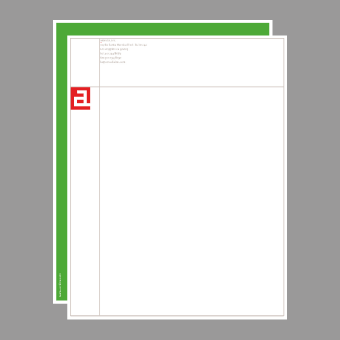
Defining a community. aMagazine is the largest-circulation
Asian-American lifestyle magazine. When aMagazine evolved into
aMedia, we developed a new identity based on a symbol,
described here by aMedia founder Jeff Yang: "We wanted to
be a place where Asian Americans are 'figure, not ground.' The
new logo celebrates this idea by turning the area around our a
into a frame for the a-shaped space within." On the magazine,
cover images always show through the symbol; the stationery
system accomodates many formats
and three aMedia offices.
what we did:
strategy · concept · design ·
preparation · production
|