|
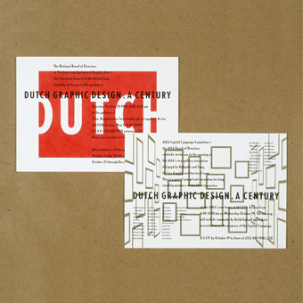
Celebrating Dutch design. For this lecture series and
exhibition at the AIGA, we created a poster
and a set of invitations
based on three images: the word "Dutch," a screaming
mouth (blown up from the newspaper), and a space defined by gold
frames (the party also marked the opening of the AIGA's new gallery).
Metallic ink and layered forms on butcher paper made the poster
a celebration of printing as well. For the address
panel, we asked Dutch designer Piet Schreuders
if we could use some old clip art from his magazine Furore. He
told us he never got permission himself, so why not?
what we did:
concept · design · preparation · production
|


